
Dilemma: how to change a wardrobe that suited my working life to fit with retirement?
In 2014, I officially retired from my position as a school librarian. As I had been off work for some time with illness, this was the obvious next step. Over the subsequent weeks and months, I began to realise that I needed to make some changes in my clothing to fit with my new life.
In last week’s Wardrobe Planning #03 post, I wrote about how my choices of the last two years have affected the balance of colours in my wardrobe, how I address gaps and, hopefully, make sensible purchases. This week, I will quickly touch on other influences on colour choice.
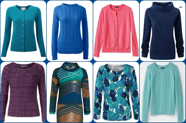
Colour collage #01
I have already shown the charts which demonstrate the colours of clothes and accessories in my wardrobe. These were made after observing what I already owned and reading fashion forums and blogs. But, what made me choose those colours when I originally purchased those items, sometimes many years ago? And why have I chosen these particular colours: navy, blue, brown, turquoise, purple, coral and creamy white, as opposed to red or orange, for example?
Well, I think the quick answer is that I have a reasonable idea which colours suit me. On further consideration, there are also aspects of age and experience to include! When I was younger, I really enjoyed colours like yellow and red. But my hair was darker and my skin was brighter and less washed out. As I have aged, I have coloured my hair a much lighter shade (not yet ready to go grey) and my skin is paler, so those colours simply don’t do anything for me. Similarly with black – it makes me look even more ill.
Colour Analysis
Some of you reading will have heard of this. As far as I know, Consultants hold colour swatches against your face to find out which colour families or seasons bring out the best in you. They then give you a set of swatches to use when you go shopping. Now, I didn’t want to spend money on this, but I read up on it and worked out which colours fitted with my face, hair and eye colours.
- Interestingly enough, they were the colours I already had in my wardrobe, or at least pretty close.
- I also thought about the outfits where I had received compliments in the recent past. Not things like “lovely dress” or “nice jumper” but “you are looking really well today” or “your face is really glowing in that outfit” (yes, amazingly, these have been said!). Again, my favourite colours were top of the list.
- Lastly, I thought about my favourite paintings or fabric or furnishings and the same colours came back to me again and again!
For example, the first time I saw the refurbished bar in my favourite hotel – I loved it. The whole room is decorated in turquoise and brown with pops of other colours – fantastic!

Ullesthorpe Court Hotel bar
So, here we are again with navy, brown, turquoise, purple, coral and creamy white: erm, can I see a gap here for coral accessories? 😉
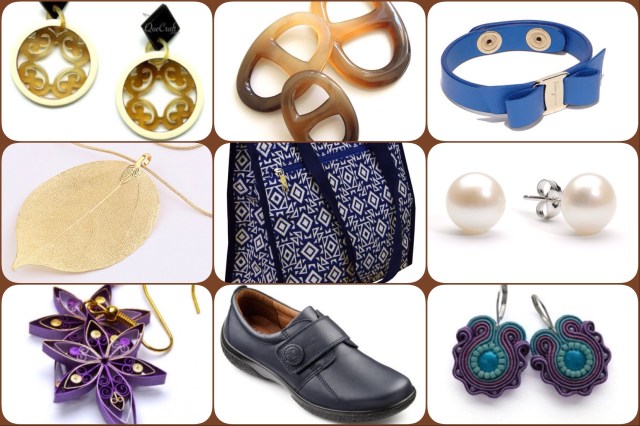
Colour collage #02
Maybe I was bored, maybe my Librain head was working clearly – a couple of years ago I thought of a great way to sort out my wardrobe and avoid the pitfalls of buying the wrong items in the wrong colours…
See the next Wardrobe Planning post.

Pingback: Wardrobe planning #28: Wardrobe colour wheel update #02 | The Librain……retired